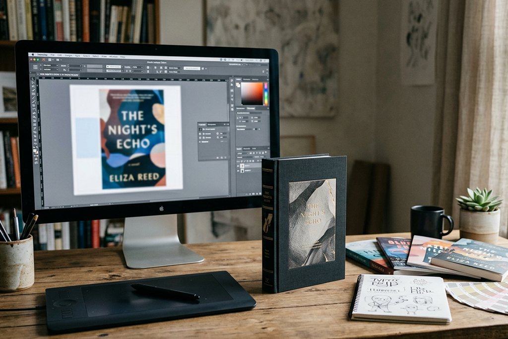
A reader decides whether to open your book in about three seconds. That is not a scare tactic. It is just how browsing works, online or in a store. I learned this the hard way years ago, watching a friend's beautifully written novel sit at the bottom of the charts for months. The writing was strong. The cover looked like a school project. Readers never got far enough to find out what they were missing.
Here is the part nobody wants to hear: your cover is not decoration. It is a sales tool, and it either does its job or it costs you readers you will never get back. The good news is that great cover design follows patterns you can learn, even if you never pick up a design program yourself.
Most readers see your cover before they read a single word of your description. On Amazon, that first impression happens as a thumbnail the size of a postage stamp. If your cover cannot communicate genre, tone, and quality at that tiny size, the blurb never gets a chance to do its job. Everything below starts from that one hard truth.
Every genre has its own visual language, and readers rely on it to find books they will enjoy. Thrillers lean on dark, high-contrast imagery. Romance favors warm colors and close, intimate framing. Fantasy leans into detailed illustration and bold typography. Before you sketch a single idea, pull up the current bestseller list in your category and look for the patterns. Skipping this step is the single most common reason self-published covers miss the mark.
Most buying decisions happen on a phone screen, not a full-size print cover. Your title needs to read clearly at 300 pixels wide, and your central image needs to make sense from across a room. If you can only judge your cover on a full screen, shrink it down and check it again. What looks striking up close often turns into a muddy blur at thumbnail size.
Typography carries as much emotional weight as the artwork. A thin, elegant script tells readers “literary fiction.” Bold, blocky letters say “thriller.” Handwritten fonts suggest something cozy or humorous. Mismatched fonts send the wrong signal before a reader even registers why, and that mismatch quietly pushes sales away. Pick two fonts at most, and let one of them carry the title.
Color shapes mood faster than any other design element. Cool blues and greys read as serious or suspenseful. Warm reds and oranges feel urgent or passionate. Pastels signal something lighter. Choose your palette based on the emotion you want a reader to feel in that first glance, not just what looks pretty on your screen.

I say this as someone who has watched authors burn weeks trying to DIY a cover that a trained designer could finish in days: hire the professional. A skilled cover designer understands genre conventions, print-ready file specs, and how covers perform across retail platforms, not just how they look in isolation. This is exactly the kind of work that companies built around book publishing, including cover design teams like the one at Spark Leaf Publishing, handle every day. Paying for expertise here almost always pays for itself in sales.
Never rely on your own gut alone. Run a few cover options past your target readers, through a Facebook group, a beta reader list, or a simple poll. Ask which cover they would click on, not which one they think is “prettiest.” Readers often pick differently than writers expect, and that gap is exactly what testing catches before launch day.
A few habits sink covers again and again: cramming too many elements onto one image, using stock photos that show up on a dozen other covers, ignoring genre expectations to “stand out,” and skipping a professional proofread of the cover text itself. Typos on a cover destroy trust instantly.
Your book deserves a cover that works as hard as your writing did. Study your genre, design for small screens, choose type and color with purpose, and bring in professional help where it counts. Do that, and your cover stops being an afterthought and starts doing what it was always meant to do: selling your book to readers who have not opened it yet.
© 2026 Spark Leaf Publishing - All Rights Reserved